
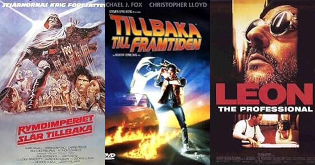
When Marketing Was Art
Walk down a cinema hallway today and you'll see the same thing everywhere: famous faces photoshopped onto a blue-and-orange background. It tells you who's in the movie, but nothing about how it feels. Generic, contractually-obligated clutter.
Compare that to legends like Drew Struzan (Star Wars, Indiana Jones, Back to the Future) or Saul Bass (Vertigo, Anatomy of a Murder). Their posters weren't advertisements — they were evocative art that captured a film's soul in a single image, using composition, color, and texture to build genuine anticipation before you'd even bought a ticket.
The Golden Age of Poster Illustration
Struzan and Bass didn't work in a vacuum — they were part of a whole guild of illustrators who treated the one-sheet as a genuine art form, and whose names deserve to be remembered alongside the directors they promoted. Bob Peak, often called the father of the modern movie poster, painted the swirling, theatrical artwork for My Fair Lady, Apocalypse Now, and Superman (1978), the last of which gave us that impossibly heroic Christopher Reeve pose that every superhero poster has been quietly ripping off ever since. Richard Amsel brought art deco elegance to The Sting and painted the moody teaser art for Raiders of the Lost Ark — the one with Indy's silhouette rearing back from a rolling boulder and a golden idol glowing beneath him, sold to audiences before a single frame of the film existed. John Alvin gave us the tender, glowing finger-touch of E.T. the Extra-Terrestrial, then pivoted effortlessly to comedy and animation with Blazing Saddles, Young Frankenstein, Aladdin, and The Lion King. And Robert McGinnis, better known for pulp paperback covers, lent his elongated, glamorous figures to the James Bond franchise, turning Sean Connery and a rotating cast of Bond girls into a kind of pop-art pin-up mythology.
What united all of them wasn't just talent — it was process. A studio would commission a painter, sometimes send them to the set, sometimes just hand them a script and a few stills, and trust them to invent an image that didn't exist anywhere in the actual footage. Bass's poster for Vertigo is built around a hypnotic spiral of his own design, not a photograph of James Stewart looking dizzy. His artwork for The Man with the Golden Arm reduced Frank Sinatra's heroin addiction to a single jagged, broken-limb graphic. That's not marketing copy — that's visual poetry doing the marketing's job by accident.
It also helped that several of these artists weren't limited to posters. Bass built an entire parallel career designing title sequences for Alfred Hitchcock and Otto Preminger — the swirling geometric titles that open Vertigo and North by Northwest, or the paper-cutout heroin needle that opens The Man with the Golden Arm, come from the same design brain that made the posters. That crossover mattered: a designer who could set the tone for two hours of film in a sixty-second title sequence was exactly the right person to compress an entire film into a single static rectangle of paper.
The Orange-and-Teal Plague
Notice every action poster uses the same blue-and-orange palette? It's because they're complementary colors — orange-ish skin tones pop against blue backgrounds. Scientifically effective. Artistically bankrupt.
Today's posters mostly promise a famous actor looking vaguely concerned. But boutique print shops like Mondo are keeping illustrated poster art alive with limited runs people actually want to hang on a wall — proof the appetite for real poster art never went away. Hollywood just stopped supplying it.
Part of the blame sits with the modern marketing department itself. A studio poster today is rarely the vision of one artist; it's the output of a committee, run through focus groups, split-tested against dozens of variants, and shaped by contractual billing clauses that dictate exactly whose face appears, in what order, and at what size relative to everyone else's. Streaming platforms have pushed this even further — services are known to test multiple thumbnail images per title and quietly show different viewers different artwork based on whatever is statistically likely to earn a click. That's not storytelling, it's conversion-rate optimization wearing a movie poster's clothes. The "floating heads" template — three or four stars' faces arranged in a triangle above a hazy backdrop — has become so ubiquitous that entire parody accounts exist purely to point out how interchangeable modern posters have become, swapping one rom-com's cast for another's without anyone noticing the difference. Superhero movies suffer from a related affliction: the "hero pose" poster, where a costumed lead stands dead center, cape or coat billowing, staring at nothing in particular while a city skyline smolders behind them. It's the Bob Peak Superman pose, minus the painting, minus the personality, repeated by an algorithm that knows it tests well and doesn't much care whether it means anything.
Foreign Posters Told a Different Story
If you want proof that illustrated poster art wasn't just an American nostalgia trip, look at what other countries did with the exact same Hollywood films. The Polish Poster School, a genuine mid-century art movement, produced promotional posters for imported films that often bore almost no resemblance to the original American artwork. Illustrators like Waldemar Świerzy, Franciszek Starowieyski, and later Andrzej Pągowski were given remarkable creative freedom under a state-run distribution system that didn't care about brand consistency — the result was surreal, painterly, sometimes unsettling interpretations of movies like Rosemary's Baby or Apocalypse Now that captured a film's mood rather than its cast list. Japanese poster design followed a similarly independent path: distributors there frequently commissioned entirely new artwork for Hollywood releases, and homegrown animation studios like Studio Ghibli treated their own posters as extensions of the film's watercolor aesthetic rather than photographic advertisements. Czechoslovak film posters from the same era pushed even further into abstraction, using collage and illustration to smuggle artistic expression past state censors under the guise of harmless movie marketing. None of these movements needed a star's face to sell a ticket — they needed one striking, memorable image, which is precisely the muscle Hollywood's poster departments have let atrophy.
What Got Lost Along the Way
Illustration allowed for exaggeration, mood, and mystery — a burning car in the distance, a hand reaching from the dark, a face half-hidden in smoke. Photoshop composites can't lie or heighten reality the same way a painter's brush can, which is exactly why the old posters still feel more alive than most of this week's releases.
There's also a practical reason illustration disappeared: photography and digital compositing are simply faster and cheaper once a studio already has a photo shoot's worth of promotional stills sitting on a hard drive. A painting takes weeks and a singular creative vision; a Photoshop composite can be turned around overnight and revised endlessly to satisfy a dozen executives, each with their own opinion about how big the lead actor's face should be relative to the title. Efficiency won, and mood lost. The irony is that illustrated posters were arguably better marketing — a painted image can promise a tone, a genre, an emotional register, in ways a literal photograph of an actor's face simply cannot. A poster for The Thing or Jaws could sell dread itself; a poster of three actors standing in a parking lot mostly just sells recognizability.
The Alternative Poster Movement Fighting Back
The good news is that the appetite Hollywood abandoned didn't vanish — it just moved underground, and then onto the internet. Mondo, founded in Austin, Texas, turned limited-edition screen-printed posters into a genuine subculture, commissioning artists like Tyler Stout, Kevin Tong, and Laurent Durieux to reimagine films from Star Wars to Blade Runner with the same painterly ambition Struzan and Bass once brought to the multiplex. Competitors like Bottleneck Gallery and Grey Matter Art followed the same model, and fans now queue online for prints the way they used to queue for opening-night tickets. The Criterion Collection has spent decades commissioning original illustrated cover art for its home-video releases specifically because it understands that a striking image sells a film's artistic credibility better than a photo of its stars ever could. Even a handful of studios have taken notice: A24 built part of its brand identity on unconventional, artist-driven poster design, and big anniversary re-releases of franchise films increasingly commission new painted artwork because fans have made clear, with their wallets, that they still want it. Artists like Olly Moss became minor celebrities in their own right within this scene, known for minimalist reinterpretations that strip a film down to a single silhouette or symbol — proof that "illustrated" doesn't have to mean "detailed," just intentional. The whole ecosystem functions a lot like the vinyl record resurgence: a format the mainstream declared dead turned out to have a devoted audience willing to pay a premium for physical, artist-made objects precisely because everything else in their media diet had gone disposable and algorithmic.
Is There Any Hope Left?
So will the mainstream ever go back? Probably not entirely — the economics of modern marketing are too tied to headshots, contractual billing, and algorithmic testing for illustration to become the default again. But the fact that a hand-painted alternative print can sell out online in seconds while the official theatrical one-sheet gets ignored on a bus stop tells you everything about where the actual artistic energy has gone. The next time a studio wants a poster people will still want to look at in twenty years, it might do well to remember that the most iconic images in movie history were never photographs at all — they were paintings, made by artists trusted to interpret a film rather than simply document its cast.
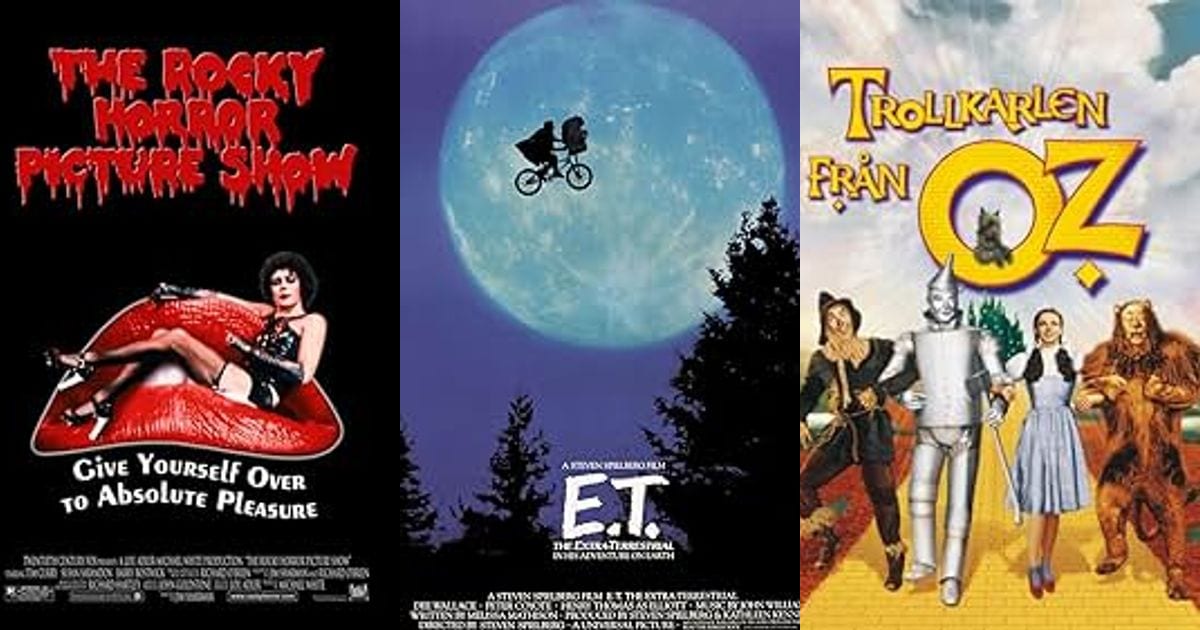
Bizarre Movie Facts That Sound Fake But Are 100% Real
A near-total wipe of Toy Story 2, a scream reused for seventy years, and a Joker payday that broke Hollywood math — the true stories behind movies are stranger than the movies themselves.
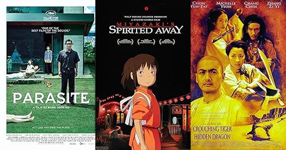
Lost in Translation: The Funniest Foreign Movie Titles Ever
Some translated movie titles are pure marketing genius, some are baffling, and a few beloved ones probably never existed at all. Here's a tour through the real, well-documented cases.
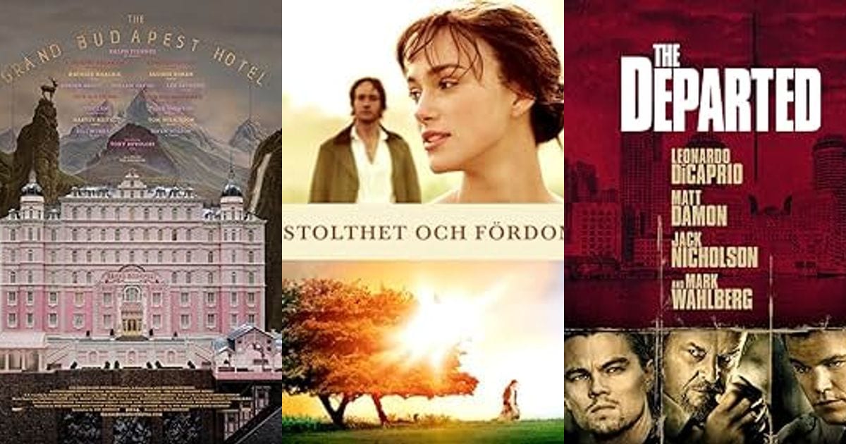
How Costume Design Tells a Story Before Anyone Speaks
No dialogue needed. Great costume design tells you exactly who a character is the moment they walk on screen.